 I’m picky about fonts. My livelihood is all about the written word, so I get pretty focused on the use and presentation of the words and language I see around me.
I’ve been recoiling in horror at the horrible use and misuse of fonts since the early days of the newest desktop publishing programs, when the ability to do layout was placed into untrained hands around the world.
I am told that my picking on these fonts makes me a snob. Okay. I’ll own it: I am a font snob. I will try not to be too obnoxious about it, but I sometimes it is hard to do.
I will talk here about just two fonts: Comic Sans and Algerian.
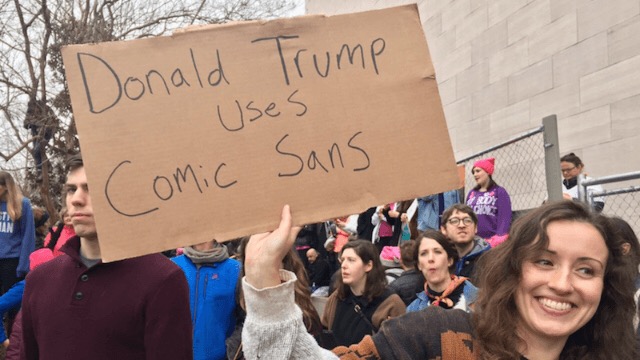
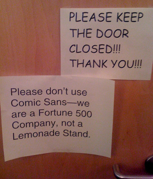
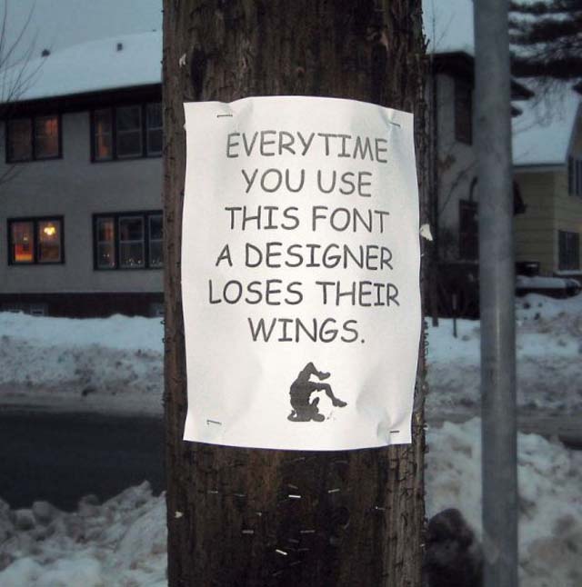
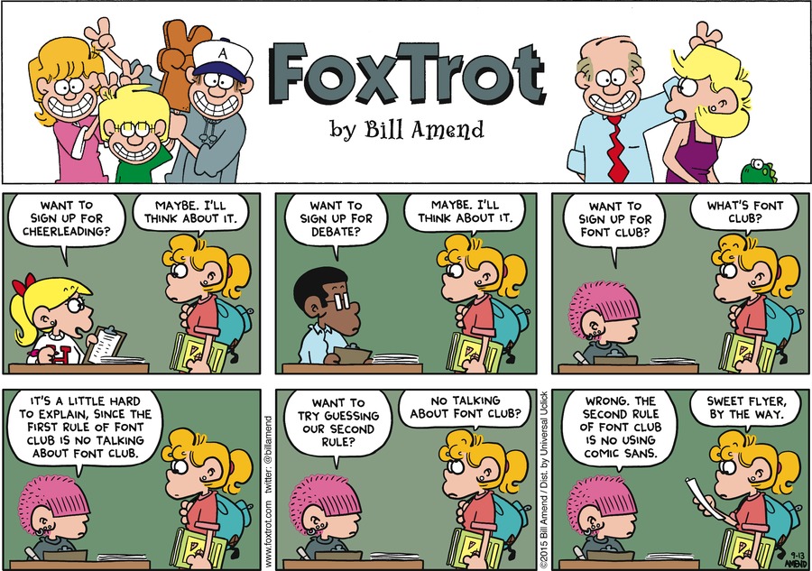
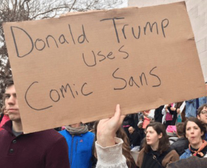
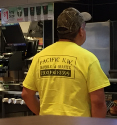
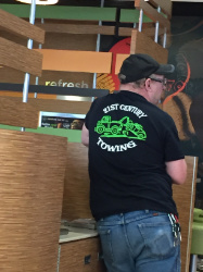
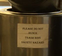
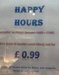
Comic Sans: This is an easy target. If you google “comic sans” you will find countless sites hating and mocking it. This font is appropriate for use if you are under 9 years old, or if you run a business that caters to said children under 9 years old. If neither of these categories describe you, then you should delete this font off your computer!
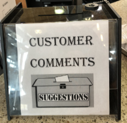
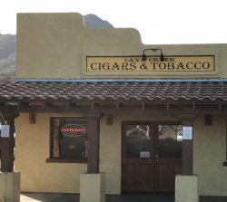
There are so many Bad Comic Sans collections available in the world that I didn’t see the need to create another one*… so I only have three photos: two because they are such horrendous examples, and one because it is a rare case of an appropriate use. (*But scroll to the bottom of this post to see my small Comic Sans humor collection, formed from bits emailed to me and found on various sites here and there over the years.)
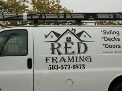
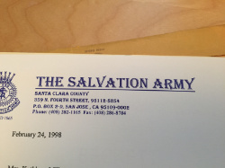
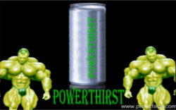
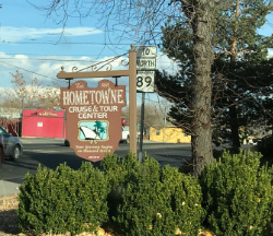
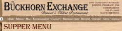
Algerian: The reason this unique-looking font it is so overused is because, like Comic Sans, it has been a free font for many years, starting (I think) with its distribution with Corel Draw in the early 90s. This font can almost be a valid choice for where you want to communicate old-timey style with just a hint of the wild west. However I don’t recommend it for use by businesses (and this is why I say it “almost” valid), because it is so incredibly overused. If you use this font for your hair salon, are you okay with the visual similarity to the tattoo parlor down the street, the newsletter from a D&D club, and a muscle-bulking power drink? I didn’t think so.
INTERMISSION: But before we get started, if you haven’t seen this absolutely incredible font-humor video, you simply must: I present to you: Papyrus, starring Ryan Gosling, from SNL. (And take note of the closing frame…)
Okay — on to the photos…
There are thousands of photos on the internet of bad/inappropriate font choices, many of which are funnier than what you’ll see here. This is my collection of font-sitings in the wild that I and stopped to photograph. I even once had a friend quickly do a U-turn so I could go back by a building to take a photo of the sign.
(I’ll keep adding to this post as I find more example in the wild.)
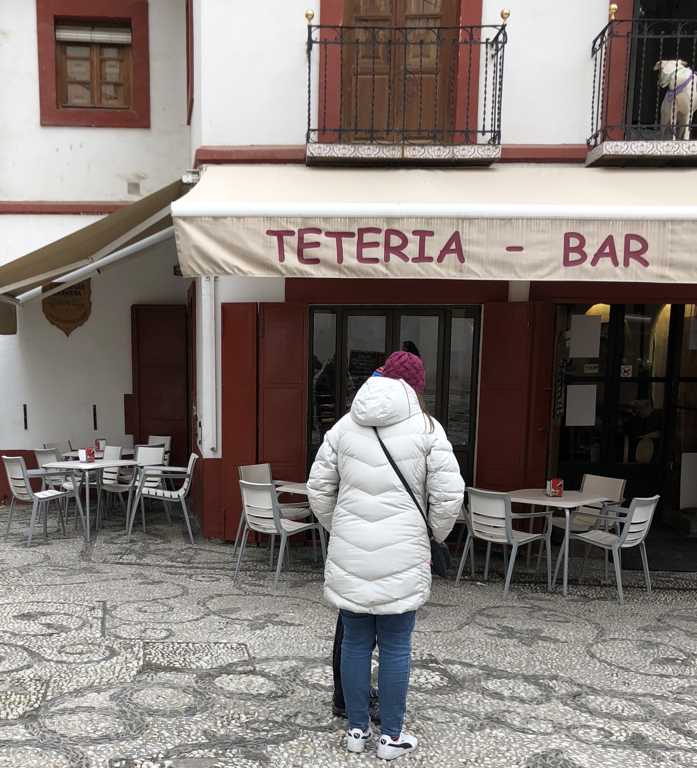
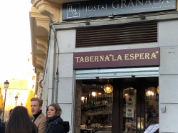
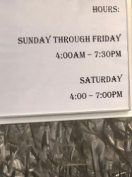
Two bad examples of the use of Comic Sans and one good one:
Unlike my Algiers examples below, these photos are clickable to see larger versions, because they must be seen to be believed. (I swear these are not Photoshopped!) The first picture was taken in Granada, Spain, and the second picture was taken in Arizona — I think in Cave Creek or thereabouts.

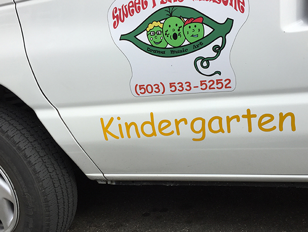
And here is what I consider to be a very rare completely appropriate use of Comic Sans:
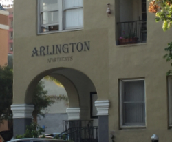
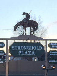
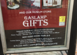
Examples from the wild of the many uses Algerian:
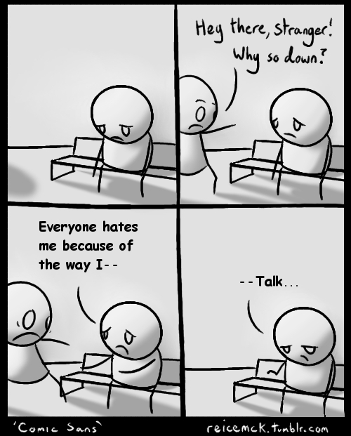
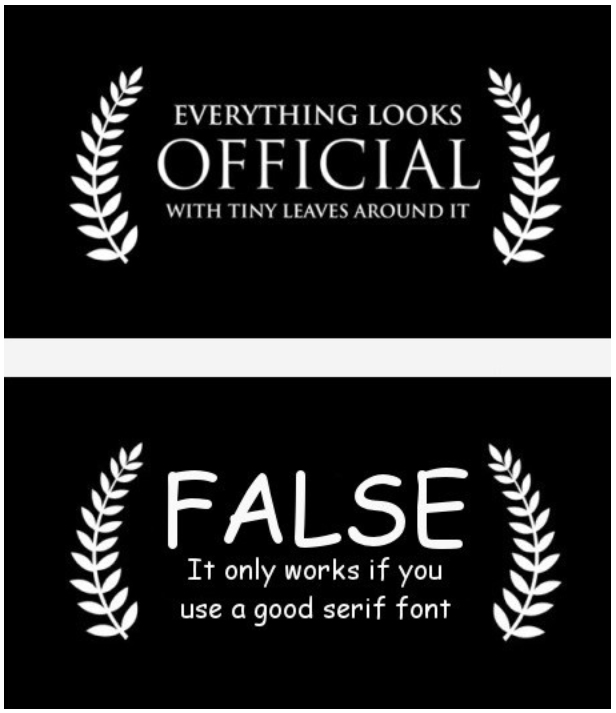
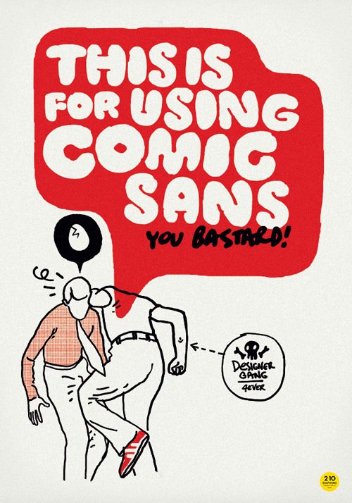
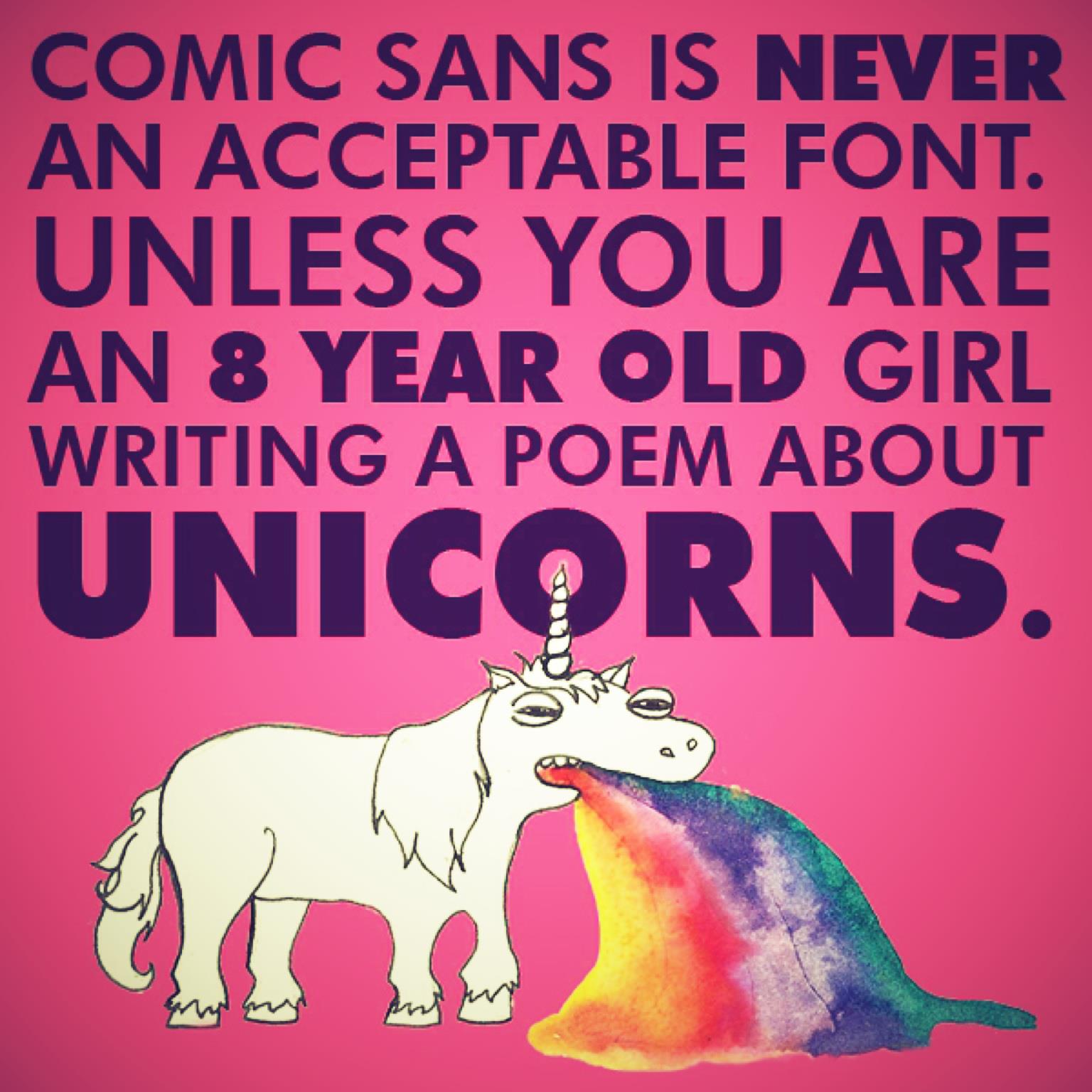
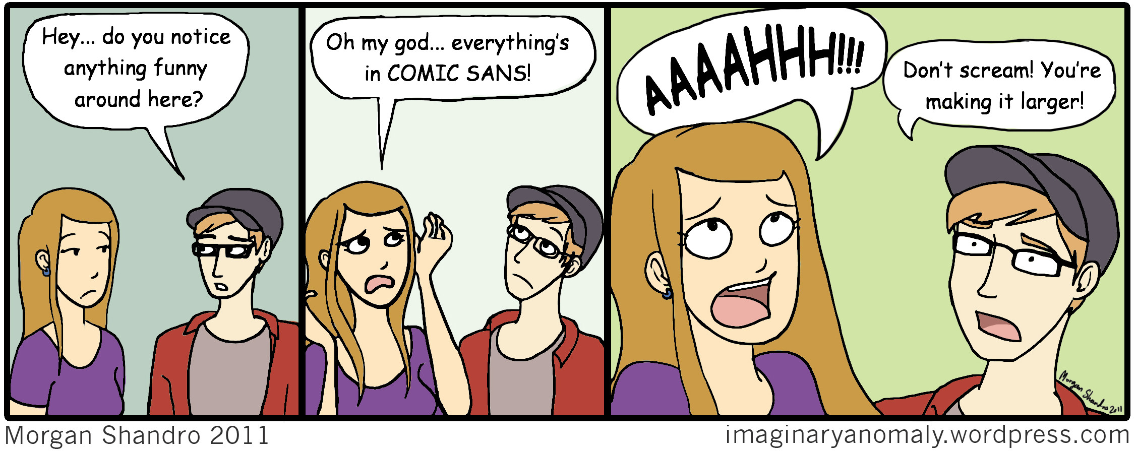
My Comic Sans Humor Collection
(Click these to see the larger version.)